Acadomia
Koncept
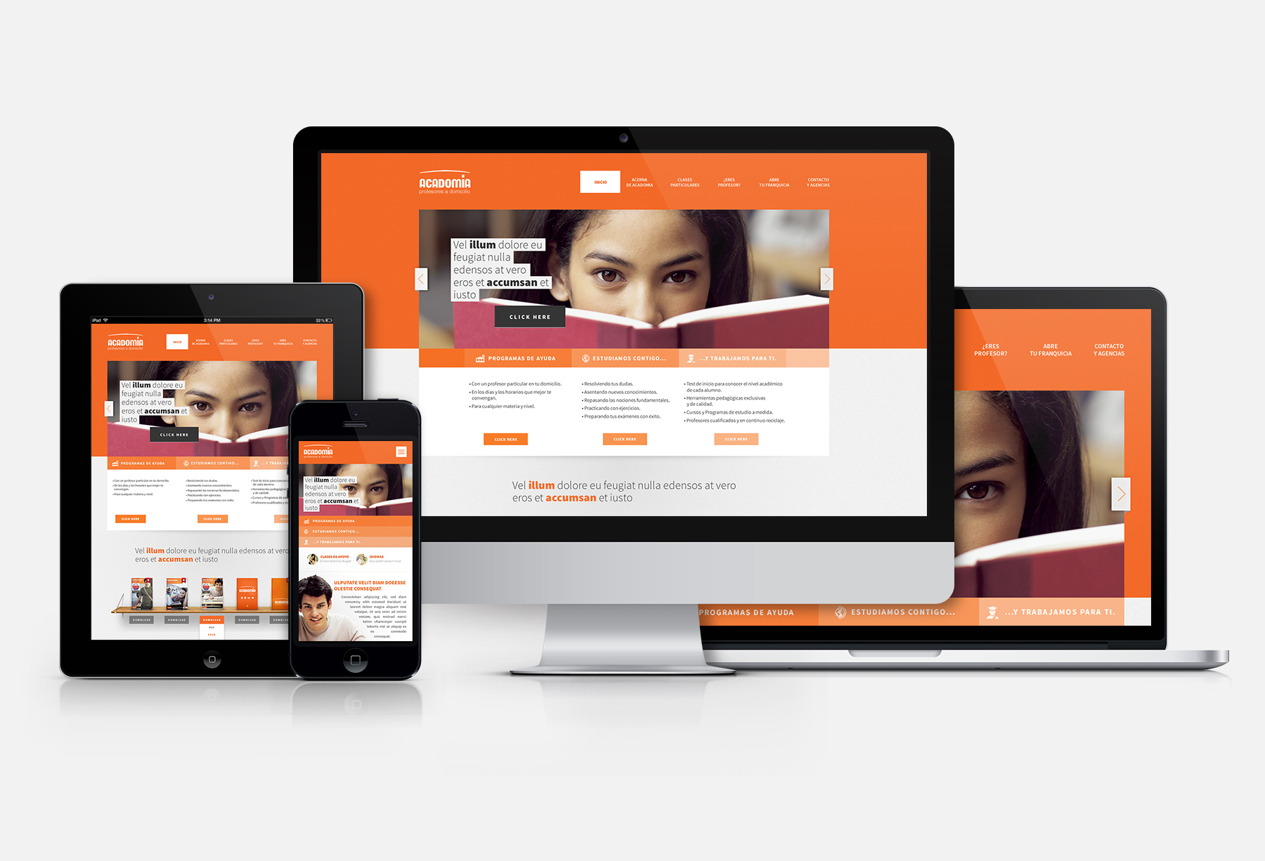
The website has to be clean, tidy and subtle. Its well-balanced layout must expose the rich and varied content, associate the brand with the educational industry, and satisfy even the most picky and demanding of tastes.
Handwerk
The interface has been designed to ensure quick retrieval of key content and easy access to information about the company and its services. The accessible contact form will encourage the reluctant to get in touch, while the CRM integration will satisfy the unsatisfied.
Resultat
An intuitive, comfortable and visitor-friendly website. Its warm, subdued and clean colour scheme reflects the professional quality of the services offered by the company.


